Tana
Branding for a wine & listening bar
- Brand
- Tana
- Year
- 2026
- Disciplines
- Brand identity
- Art direction
- Motion design
Tana is a wine & listening bar: from six you’re at the bar with wine by the glass, from nine you listen to a whole record, start to finish. I created the complete branding: name, mark, venue, objects, launch, website and brand book.
Two acts, one evening
Tana was made for drinking well without the ceremony of a traditional wine bar, and for hearing music properly, not as background noise. Its crowd is aged between 25 and 50, curious about wine, music and design, and turns up in the jumper and trainers of any ordinary evening.
The bar and the listening run through every part of the brand: with only the bar, Tana would be a wine bar like any other; with only the listening, a concert hall.
The name and chi c’è
A tana is a den, a hideaway, and it’s also home base in hide-and-seek: ‘tana libera tutti’, the call that sets everyone free. The logo is TANA in letters cut out with scissors, their edges wavering slightly: the warmth comes from the hand, not from the colour.
Next to the logo lives ‘chi c’è’ (‘who’s there’), a dark dome with two eyes that always peeks up from the bottom edge. It’s the social media profile picture, it’s on the labels and the coasters, and it moves: it turns up, reads the wine list, listens to a record, winks. I animated it like a paper cut-out.
Colours and typefaces
There are four colours. Garnet covers the large surfaces, the sign and the posters; ink draws the logo and the darkness of the den; cork acts as the paper; sage appears only on the white wine. Garnet is a dark, brownish red, a long way from the bright red of trattoria signs.
Three typefaces, each with its own job: Avara for a single word or number, Gambetta for the name of the evening’s wine and record, Suisse for everything else.
The venue
The venue is two rooms, one after the other, like the two acts of the evening. At the front is the bar, under a barrel vault in honey-coloured lime plaster, with a brushed-steel counter and a garnet bench. A pietra serena arch leads through to the listening room, with timber walls right up to the vaults, a long table and the centre left clear.
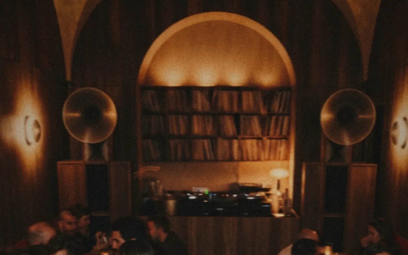
At the far end of the room the console sits between two steel horn speakers, in front of the record wall. The lighting is low and soft, as it would be at home. From outside, you know the place by the enamelled sheet-metal sign above the arched doorway, lit by a spotlight.
At the bar
At the bar, you can tell it’s Tana from the objects: the wine glass with the logo sandblasted into it, the pulpboard coaster with chi c’è, the long, narrow wine list, the cork with its neck tag, the apron and the stationery. To take home there’s the garnet tote bag, printed with ‘ultimo giro, giuro’ (‘last round, I swear’), and the bottle bag.
The house wine
The house red and white have the word stacked on the label, ‘ro/sso’ and ‘bian/co’, and no vintage. The words are big so that people who can’t tell red from green can read them too: on the bottle, colour alone wouldn’t be enough.
The listening night
The listening night has its own A3 poster: a one-word title and a photo inside the silhouette of chi c’è. Around it are the ‘sessions’ record, the stories, the night’s playlist, the pass to keep on your phone and photos of the night on Instagram: the amp, the request book, the record brought to the bar.
Before the opening, in the square
Before the opening, chi c’è becomes a listening booth the size of a phone box and heads out into the square: garnet sheet metal, the logo on top, chi c’è on the side and a velvet curtain instead of a door. Inside, between cork walls, you stand at the steel console and listen on headphones fixed to the turntable.
You book a slot, and every week the booth moves to a different square; on opening day it stands outside the bar’s front door. It’s a pop-up, made of lightweight panels that go up and come down easily.
Photo of the square: Mr Allan Parsons, Flickr, CC BY 2.0
The website
The website follows the evening. It opens with two photos of the venue, the bar at 6pm and the console at 9pm, and TANA across the full width. Below come three bands of colour: at 6pm we open, at 9pm we listen, at 1am it’s the last round. At the bottom chi c’è sits on the name and says goodbye: ‘Ci vediamo al banco.’ (‘See you at the bar.’)
The brand book
All of this goes into a 49-page brand book: who Tana is, the logo and chi c’è, the colours, the typefaces, the tone of voice and the applications, with the sizes to order from suppliers. It’s written so that the bar could open in another city too, without me.